Project Overview
Language in the Landscape is a pocket zine that explores the relationship between Indigenous languages and the natural landscape of British Columbia. It highlights how place names rooted in the languages of the xwməθkwəy̓əm (Musqueam), Sḵwx̱wú7mesh (Squamish) and səlilwətaɬ (Tsleil-Waututh) Indigenous Nations carry deep cultural knowledge, history and identity that are often lost or altered through translation and colonization.
The project was designed to be accessible to a general public audience while honouring the gravity and significance of Indigenous language and place, balancing visual design with cultural respect and editorial clarity.
The Client
City Studio Vancouver is a partnership between the City of Vancouver and local post-secondary institutions that connects students with real civic challenges. Through City Studio, students collaborate with city staff and community partners to develop creative, research-driven solutions that contribute to public life in Vancouver.
This project was developed through SFU's PUB 438 course as part of the City Studio programme, giving it a real community context and a genuine audience beyond the classroom.
Problem Statement
How might we design a publication that makes Indigenous language and its relationship to landscape legible, approachable and meaningful to a general audience, without reducing or misrepresenting the communities it draws from?
Indigenous place names across British Columbia carry layers of meaning — ecological, cultural, spiritual and historical — that are invisible when only the colonial name is known. Most people who live and move through these landscapes have no access to the Indigenous languages that named them first.
How might designers support Indigenous-led place renaming initiatives by creating publications that foster understanding, correct pronunciation, and long-term language visibility?
Research Methodology
We began by exploring how similar zines and publications had been created, studying their layouts, storytelling approaches and visual styles through online archives and platforms such as Pinterest. We then researched content by exploring Indigenous language preservation resources and community-based storytelling platforms.
Indigenous Language Resources
We explored FirstVoices — an online platform dedicated to sharing and revitalizing Indigenous languages, oral histories and cultural knowledge. We also reviewed the Squamish Nation Language & Cultural Resources and the Tsleil-Waututh Nation Culture & Language page.
City of Vancouver Indigenous Resources
We referred to City of Vancouver Indigenous resources to learn about land acknowledgements, Indigenous histories and connections to place — ensuring our research remained respectful and community-focused.
Indigenous Visual Traditions
We studied Indigenous artwork and visual traditions to inform how we might present the zine respectfully, avoiding decorative use of cultural imagery and focusing on language, land and community.
Zine Format Research
We compiled a moodboard of zine examples to identify formats, visual systems and editorial approaches that felt accessible and appropriate for a general public audience encountering Indigenous language for the first time.
Key Findings & Insights
Research revealed that the most effective Indigenous language publications prioritize clarity and restraint — allowing the language and its meaning to lead, rather than imposing a heavy visual treatment. Accessibility for a general audience and cultural sensitivity are not in conflict: they both point toward the same design decisions.
Design Process
The design process began with editorial structure — deciding what content to include, how to sequence it and how to create a reading experience that felt like storytelling. The pocket format was chosen deliberately: small enough to feel personal and portable, but substantial enough to communicate with depth. We went through several iterations, progressively simplifying the content and refining the layout until the zine guided users naturally from acknowledgment through to learning, reflection and the map.
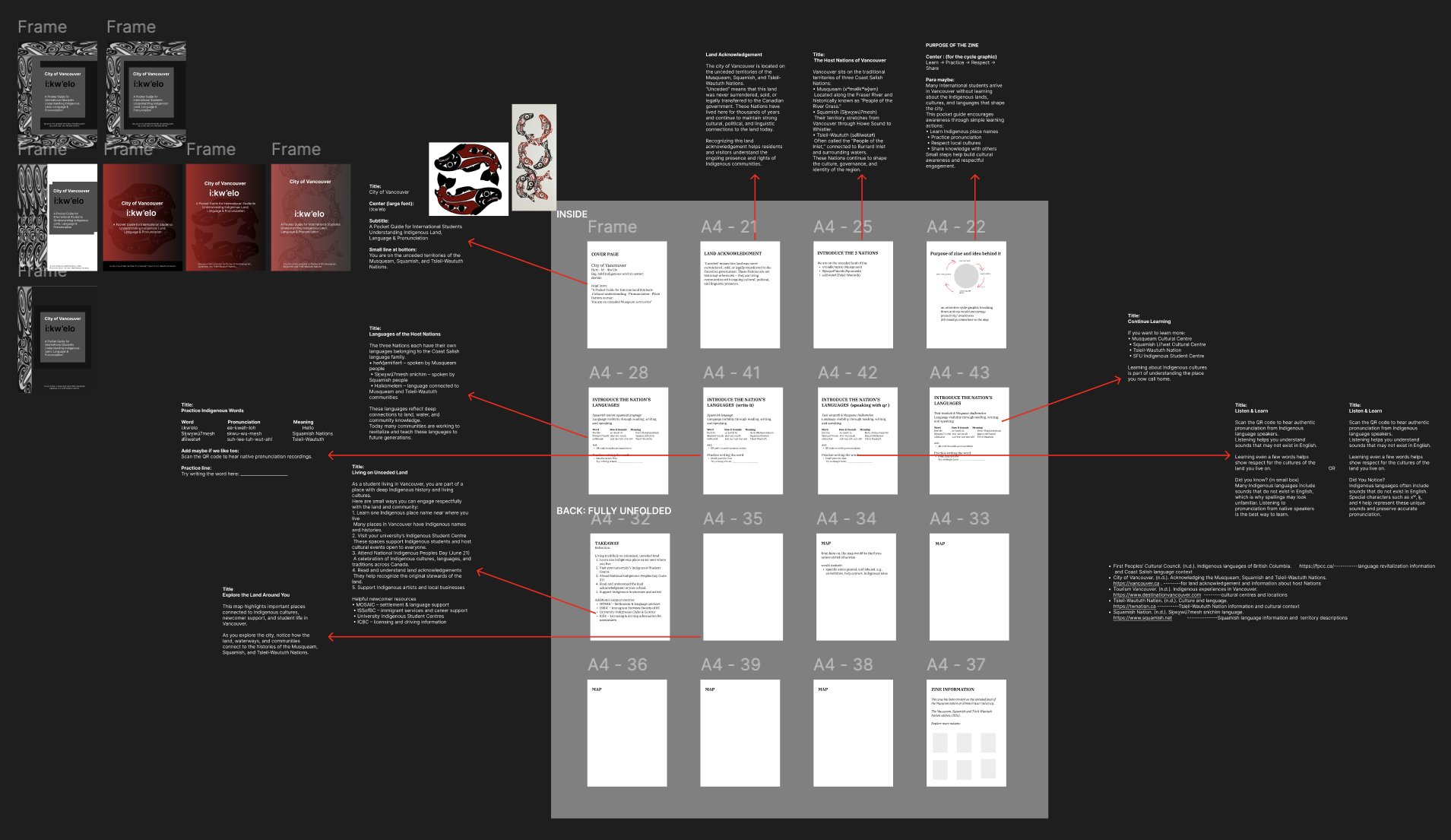
First Draft: Content Heavy Wireframes
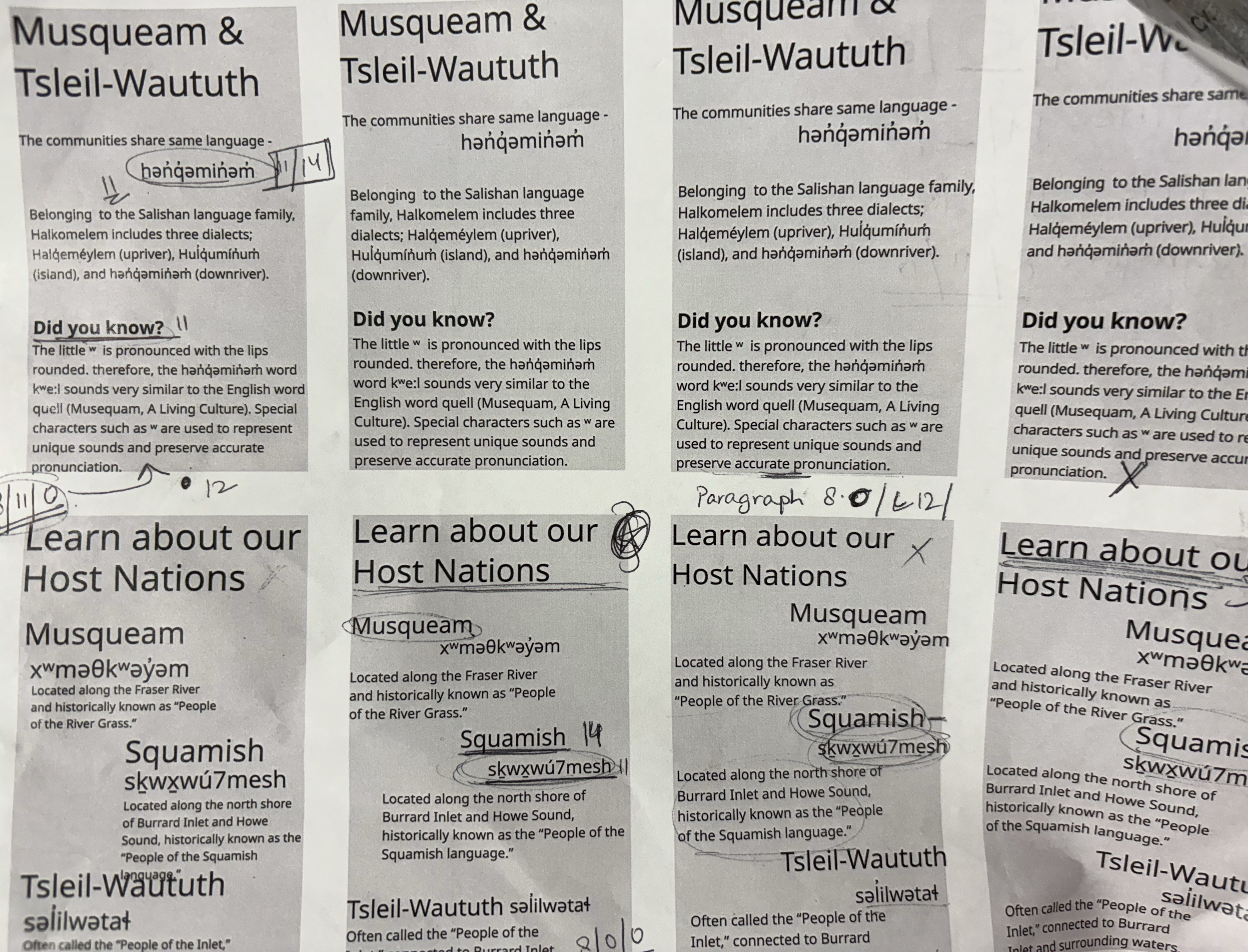

Printing to Finalize Content and Font Choice — Style and Size
Exploring Patterns and Watermarks Visual Design Style

Printed Iterations during the Project Timeline
Design Solution
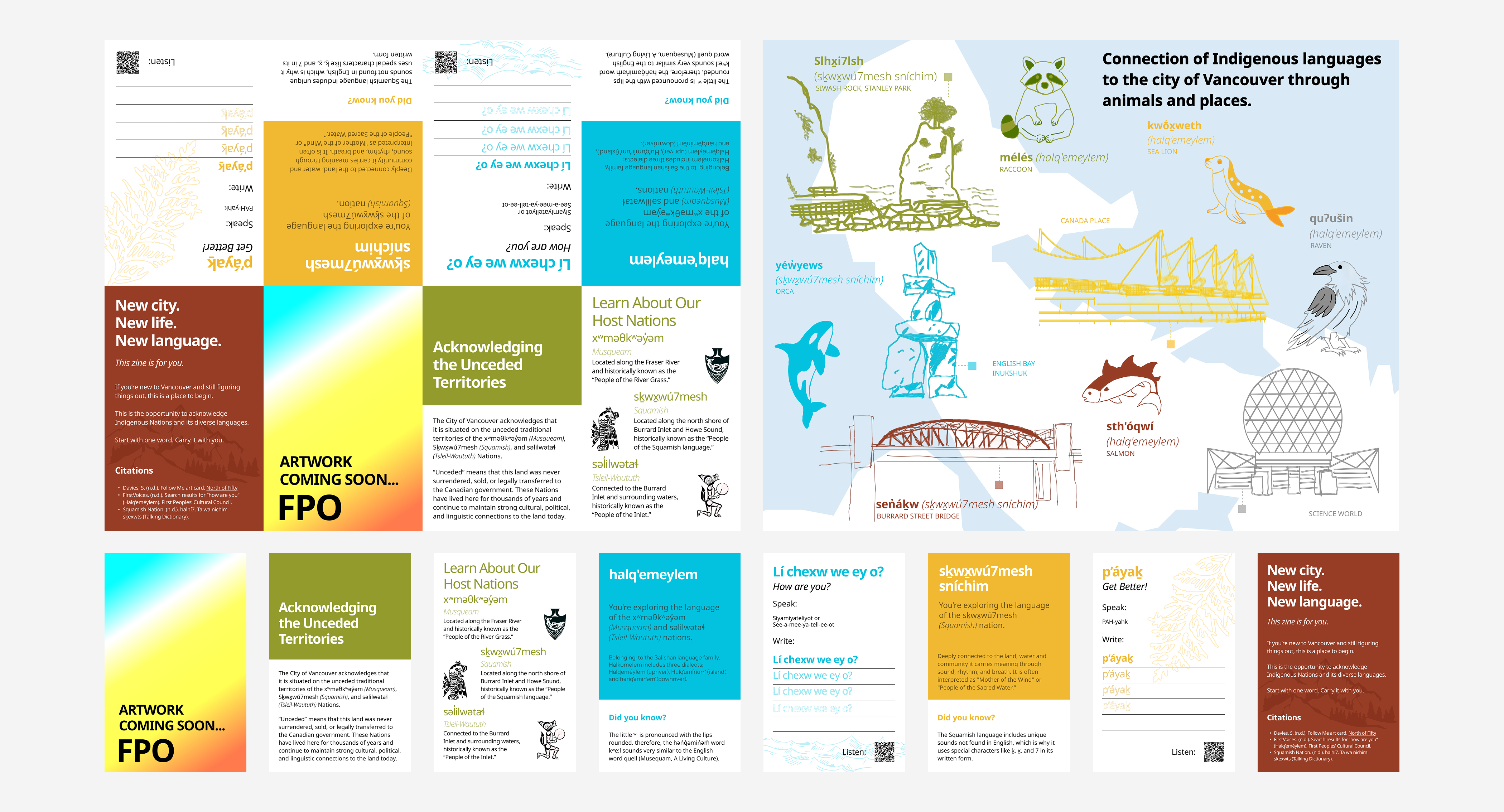
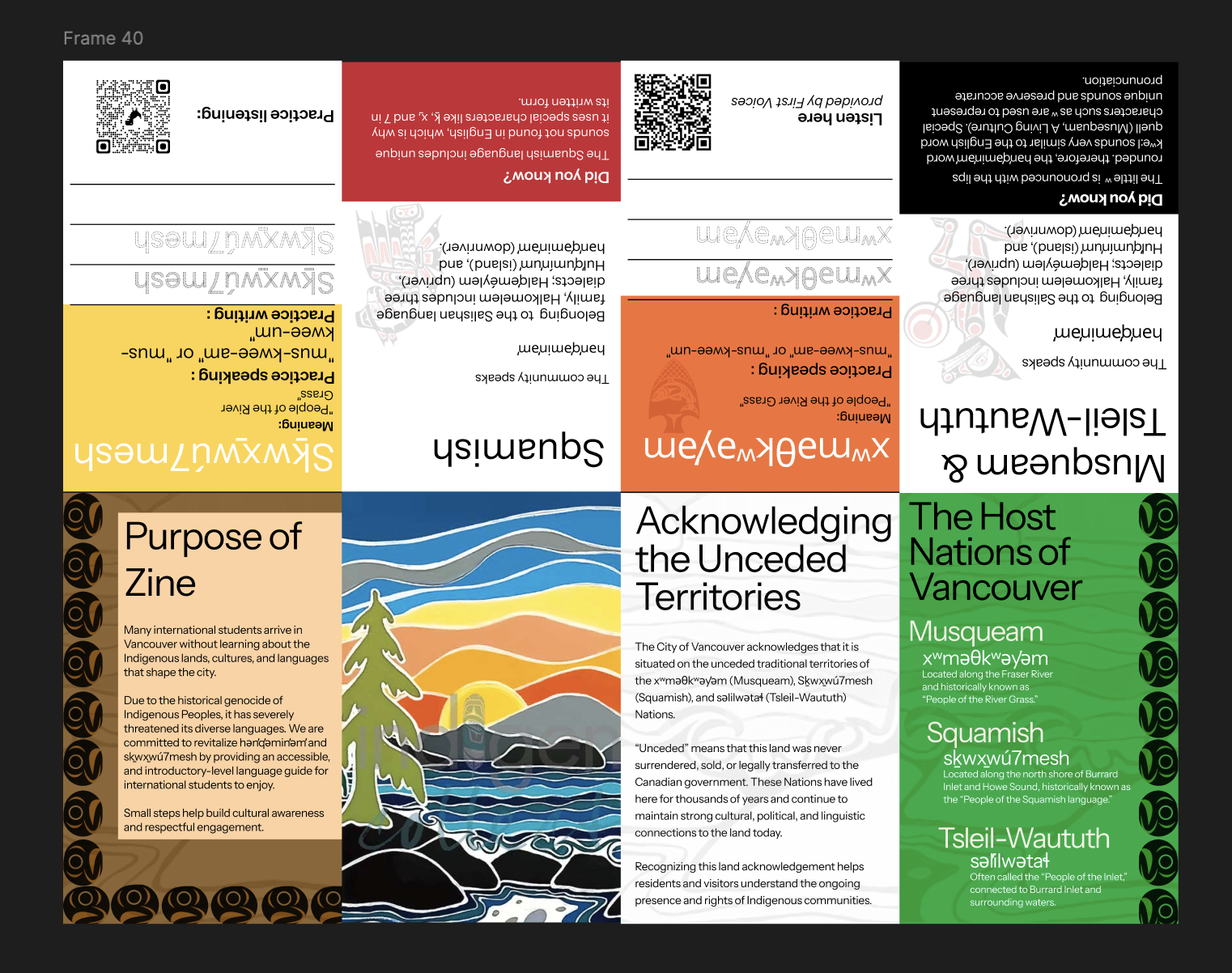
The final zine uses a vibrant yet balanced colour palette inspired by natural elements — land, water and mountains — to symbolically connect Indigenous languages to their relationship with the environment. Each section is colour-coded to support navigation and cognitive ease, allowing users to move through the zine intuitively without prior knowledge.
The foldable format guides users step by step through acknowledgment, learning, reflection and the map — using simple conversation prompts, pronunciation guides and QR codes for optional audio support. The reflection section gives users space to write and engage personally, turning the zine into a participatory object rather than a passive one.

Indigenous Artist Artwork
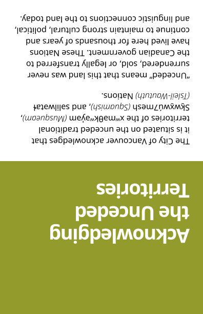
Indigenous Land Acknowledgement
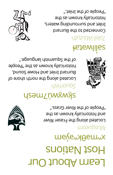
Host Nations Information
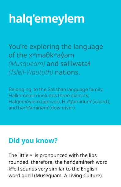
Halq'emeylem
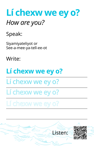
Reading, Listening and Writing Halq'emeylem
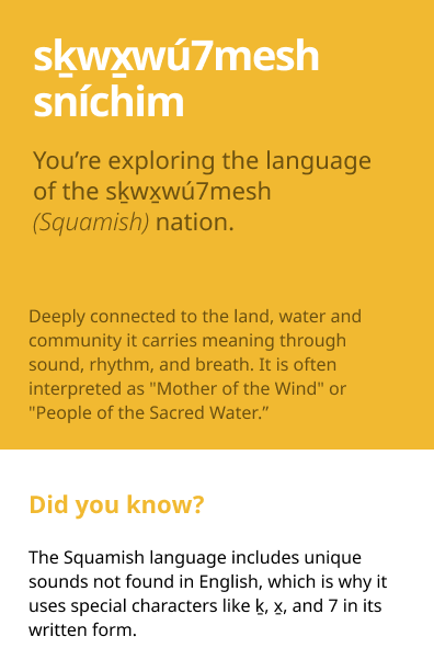
Sḵwx̱wú7mesh Sníchim
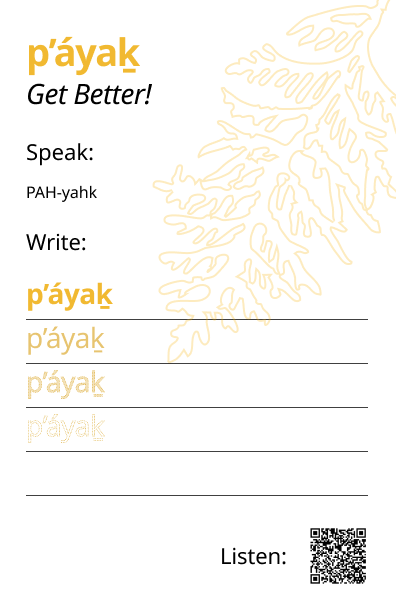
Reading, Listening and Writing Sḵwx̱wú7mesh Sníchim
Vision of Zine
My Reflection
This project taught me that good design sometimes means stepping back and letting the content lead. Working with Indigenous subject matter as an international student designer required careful research, deliberate choices and a constant awareness that we were approaching knowledge that belongs to communities we are guests in. We were learners, not experts — and that framing shaped every decision we made.
We used trusted, Indigenous-led resources like FirstVoices throughout, and avoided using Indigenous culture for visual decoration. The ethical weight of the project made it one of the most meaningful things I have worked on — and it fundamentally changed how I think about the responsibility a designer holds when the subject is not theirs to own.